


Excess Mortality Still Correlated With COVID Vaccination Rate - Dec 2023 data
Data to be swept under the rug, as usual

December 2023 was unusually but not unexpectedly severe: a new COVID variant, JN.1, swept Europe and the rest of the world. Other pathogens circulated as well, in addition to the usual killers such as cancer, heart disease, blood clots, dementia, and so on. As a result, Europe experienced a month of 10% greater mortality than expected.
What happened in December 2023 allows us to ask: Could vaccination rates affect excess mortality rates a long time after vaccinations? December 2023 was 2.5 years after people received their first doses, so looking at the data for that month could help us answer that question.
Sadly, data from last December shows a strong positive correlation between excess mortality and Covid vaccination rates, despite most first doses given out long ago, 2.5 years before that month.
We were told that COVID-19 vaccines protect us from severe illness and death. Therefore, we are supposed to expect countries that gave their citizens more COVID-19 vaccines to fare better.
Those who still believe such assertions may be surprised: in December 2023, like during many recent periods, more Covid vaccines meant greater excess deaths.
I downloaded excess mortality data from Eurostat and Covid vaccination rates (percentage of citizens who received initial doses of Covid vaccine) from Statista.
Here’s the data:
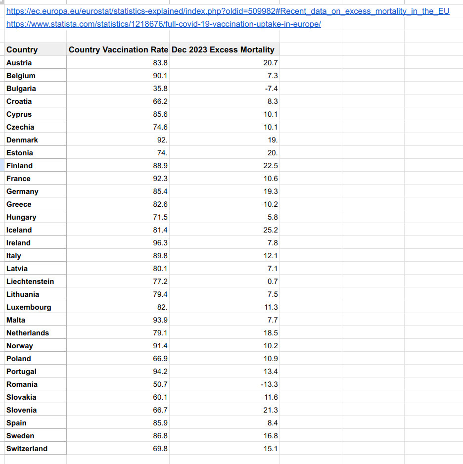
We can analyze this dataset with a “linear regression calculator” to see if the data shows a trend:
Surprisingly, the analysis shows that COVID vaccination rates explain 24% of excess mortality, despite vaccinations happening in the distant past! Not only is there a trend, but it is also highly statistically significant, with a p-value as low as 0.0057.
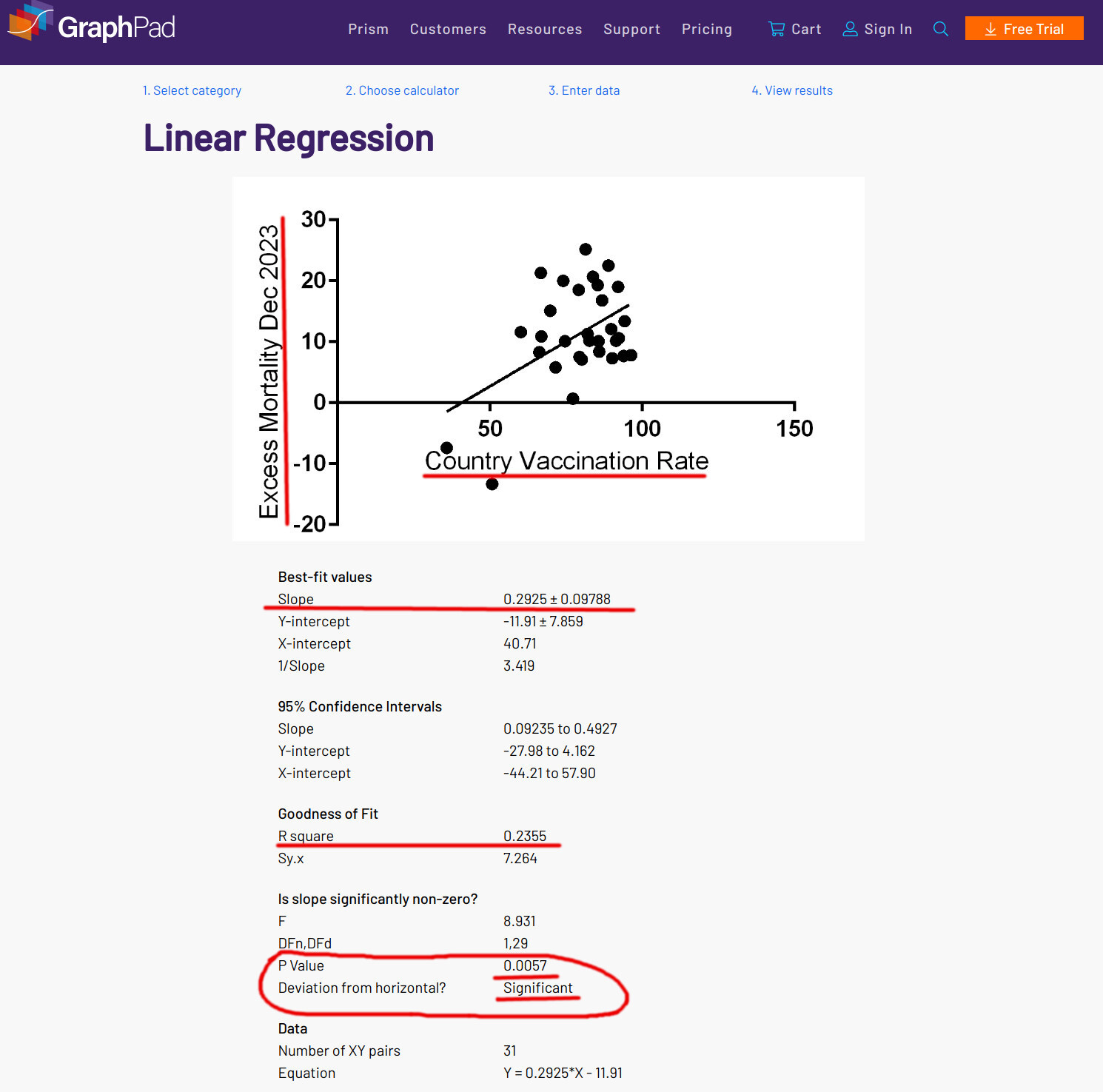
The December results are similar to the pattern for the entire past year, which suggests that they are not spurious but reflect a real phenomenon.

Relationship for the whole year of 2023, from the above post, is here:
My desire is for mortality to return to normal and for all people, regardless of vaccination status, to enjoy a low rate of death and serious illness. Sadly, what we have instead is elevated rates of death and Covid vaccines still affecting the unwitting recipients’ changes of negative outcomes.
This excess mortality is not investigated. The people asking why citizens of their countries are dying at elevated rates are demonized and dismissed as conspiracy theorists.
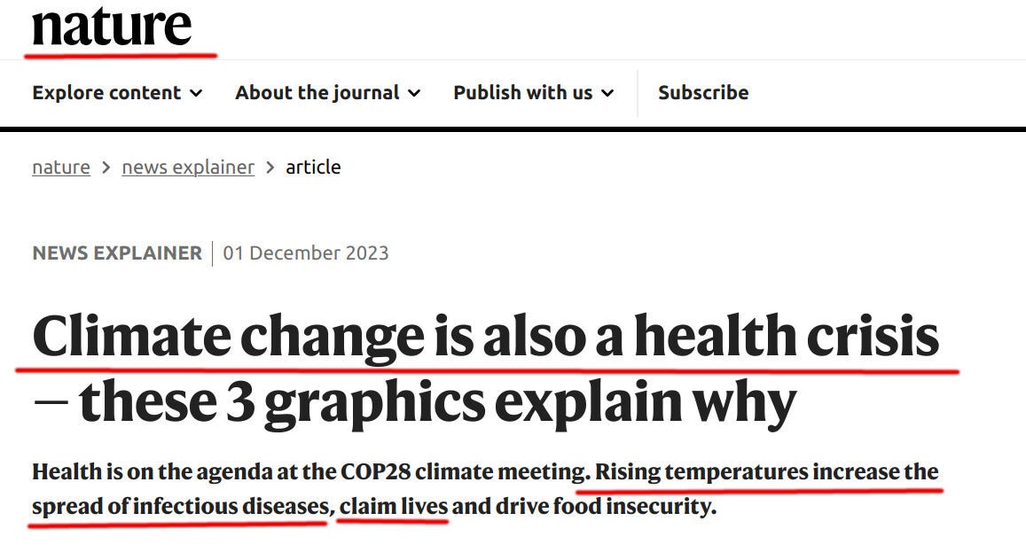
The real culprit, we are told, is climate change:
Why would COVID vaccination rates explain excess mortality if climate change were the culprit? Please help me answer this question!
Should we stop asking for explanations? Is speaking the truth dangerous to our democracy? Should we all shut up?
Let us know what you think!
Obama here yesterday, UK, visiting Rishi Sunak the PM. No comments about what they spoke about. No state dinner, just a cup of tea. Constant rumours Rishi will be dumped for Penny Mordant, a big time WEF puppet. Here in the Uk we will never get the truth. June Raine head of the UKHSA stepping down in Sept. This is the same gov’t organisation that changed the mathematical equation to count excess deaths in the UK. Their new mathematical model removed 20,000 bodies from last yrs excess death count. No one can work out this new model. Crooked, bought, liars here in the UK. Rishi told MP Andrew Bridgen three wks ago the vaxxes were safe. Penny Mordant, called MP, Andrew, who said covid jabs have caused excess deaths, she called him a covid conspirator in parliament and threatened him.
We are drowning in lies and it comes at us from all sides. You could see it during covid if you allowed yourself to see them. My biggest shock was that most people did not want to, they were willing to seek comfort in the lies regardless of how detrimental it could be to them. This continues today, many people still wallow in the covid narrative and the "safe and effective" covid injections because their "authority" tells them so and I find it very disturbing. The people who are aware must continue to ask questions and resist the lies or else we will be lost and will have to accept living a life of tyranny, no matter how nicely they present it.