
UK Vaccine Hell predictably worsens in one week.
Vaccines invite disease even more, and death protection drops in just one week

For those of you who read my week-old article UK's Vaccine Hell gets worse every week, this is an update.
If you are reading this from Twitter or Reddit or Facebook without having read the above article, please read my original report first to understand my (very simple) methodology. The most important part is that I exclude persons under 18 years old.
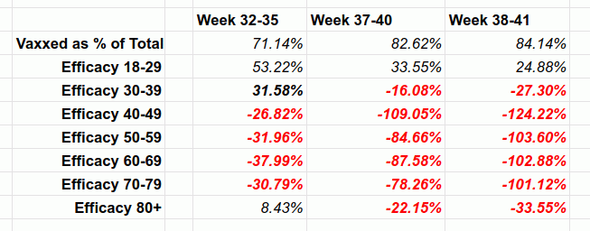
This post provides an update based on the next weekly PHE report provided here: PHE Vaccine Surveillance Report Weeks 38-41.
Please note that the changes described herein, as bad as they are, are far worse since previous period (weeks 37-40) and new period (weeks 38-41) overlap by three weeks.
In any case, here’s the update:
Percentage of vaccinated cases as percentage of total changed from 82.62% to 84.14%.
Percentage of vaccinated deaths as percentage of total changed from 79.41% to 81.09%
Vaccine effectivenes against illness dropped much further (and shockingly fast, in just ONE week) into even worse negative territory. Here it is split by 10-year age groups:

Vaccine effectiveness against DEATH, while remaining positive, dropped dramatically for just one week (and again, considering that three weeks out of four are included in both averages):
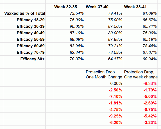

If this is not vaccine hell, then what is it?
And most importantly, where is USA on this curve? CDC is hiding data from us.
High Igor, thanks for the work you're doing. Your work here inspired me to do a similar project for where I live in Ontario, Canada. Unfortunately our government doesn't seem to be tracking deaths by vaccination status, but they are tracking cases and hospitalizations by vaccination status. Recently, when reporting the numbers, they've increasingly stopped breaking down all of the numbers, and are now instead lumping "unvaccinated, one dose, unknown status" into the category of "not fully vaccinated," because the vaccinated case numbers keep rising relative to the unvaccinated numbers, so they want the unvaccinated numbers to look as high as possible.
Did you see the report the UK posted today for week 43? They stopped tracking the case rates per 100k, and left this little note at the bottom of each table:
"In the context of very high vaccine coverage in the population, even with a highly effective vaccine, it is expected that a large proportion of cases, hospitalisations and deaths would occur in vaccinated individuals, simply because a larger proportion of the population are vaccinated than unvaccinated and no vaccine is 100% effective. This is especially true because vaccination has been prioritised in individuals who are more susceptible or more at risk of severe disease. Individuals in risk groups may also be more at risk of hospitalisation or death due to non-COVID-19 causes, and thus may be hospitalised or die with COVID-19 rather
than because of COVID-19."
Hilarious. They either saw that their data was being used to write articles like this one, or they saw a concerning trend and are putting a stop to it. The UK wasn't always publishing their numbers for cases, hospitalizations, and deaths, so I wonder what made them start? What are these people seeing that we're not allowed to?
thanks for the very interesting articles. I am in NZ and our govt is well on the way to a Lithuania situation, very high vax rates, vax mandates, never ending lockdowns (now into month 3). Yet still the sheeple listen to the lying media and a handful of compliant govt employed "scientists". Looking at the UK MOH data, although the total numbers look very bad for the vaxxed, the fact checkers will simply say that the rate per 100,000 population gives the "true" situation.
The gaps are closing but for most age groups, the death rates are still triple or more in the vaxxed vs unvaxxed in terms of per 100,000 population. How do we account for this? I want to be able to counter these arguments.
I suspect that in the over 60s group, the vax rates are so high, that virtually the only people not vaxxed are just too old, frail, or sick to even be vaccinated due to risk of imminent death. In NZ our over 60 vax rate for first dose is now at 95% (pfizer). Second dose around 70%, and I have no reason to think that most first jabbers will not go for the second.
I would not be surprised if NZ ends up being the single most vaxxed country in the world, such is the obsession of out govt, the total complicity of MSM, and the utter mindless sheepish compliance of our population